site내 content가 가변길이인 경우 footer 하단 처리 방법
site내의 content의 height가 가변길이인 경우 footer의 위치를 깔끔하게 처리하고 싶었다.
원하는 구성은 다음과 같았다.
- content의 height가 browser의 height보다 짧은 경우 footer는 browser 하단에 위치
- content의 height가 browser의 height보다 긴 경우 footer는 content 하단에 위치
우선 간단한 html을 구성하였다.
<!DOCTYPE html>
<html>
<head>
<title>test</title>
</head>
<body>
<div class=”wrap”>
<header>Header</header>
<section>
<div>
<ol>
<li>Content</li>
<li>Content</li>
<li>Content</li>
<li>Content</li>
<li>Content</li>
<li>Content</li>
<li>Content</li>
<li>Content</li>
<li>Content</li>
<li>Content</li>
</ol>
</div>
</section>
<footer>Footer</footer>
</div>
</bodY>
</html>
기본적으로 상단(header), content(section), 하단(footer)로 구성하였다.
결과부터 보자면 다음과 같다.
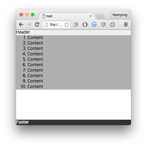
content의 height < browser의 height인 경우
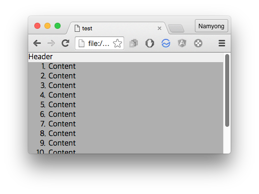
content의 height > browser의 height인 경우
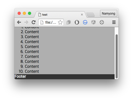
scroll을 내려보면 content 하단에 붙어있는 것을 확인할 수 있다.
원했던 구성이 깔끔하게 처리되었다.
(content의 height가 browser의 height보다 짧은 경우에는 하얀 여백이 보여지게 되는데 이부분은 div.wrap의 background-color를 주는 식으로 해결이 가능하다.)
이제 layout을 구성한 css를 확인해보면 다음과 같다.
* {
box-sizing: border-box;
-webkit-box-sizing: border-box;
-moz-box-sizing: border-box;
}
html {
height: 100%;
}
body {
margin: 0;
height: 100%;
}
.wrap {
min-height: 100%;
position: relative;
padding-bottom: 19px; /* footer height */
}
header {
background-color: #EFEFEF;
}
section {
background-color: #AFAFAF;
}
ol {
margin: 0;
}
footer {
position: absolute;
bottom: 0;
left: 0;
right: 0;
color: white;
background-color: #333333;
}
기본적인 개념은 다음과 같다.
- html, body의 height를 100%로 설정
- content의 height가 browser의 height보다 짧은 경우를 위해 div.wrap class에 min-height: 100% 설정
- footer는 position: absolute로 하여 bottom: 0에 고정
- footer를 content기준으로 위치를 잡기 위해 div.wrap class를 position: relative로 설정
- footer가 content(section)과 겹치지 않게 하기위해 div.wrap에 footer높이 만큼 padding-bottom을 지정
- padding-bottom에 지정한 값을 영역값으로 잡기 위해 box-sizing을 border-box로 지정
이 방법의 경우의 전제조건은 footer의 height값이 고정이어야 한다는 것인데 footer의 height값이 가변인 경우에는 좀 더 고민을 해봐야 할 것 같다.
추후 관련 issue가 발생되면 추가로 post할 예정이다.
 nybounce
감사합니다! 공부하는데 큰 도움이 되었습니다!
감사합니다.