보관물
site내 content가 가변길이인 경우 footer 하단 처리 방법
site내의 content의 height가 가변길이인 경우 footer의 위치를 깔끔하게 처리하고 싶었다.
원하는 구성은 다음과 같았다.
- content의 height가 browser의 height보다 짧은 경우 footer는 browser 하단에 위치
- content의 height가 browser의 height보다 긴 경우 footer는 content 하단에 위치
우선 간단한 html을 구성하였다.
<!DOCTYPE html>
<html>
<head>
<title>test</title>
</head>
<body>
<div class=”wrap”>
<header>Header</header>
<section>
<div>
<ol>
<li>Content</li>
<li>Content</li>
<li>Content</li>
<li>Content</li>
<li>Content</li>
<li>Content</li>
<li>Content</li>
<li>Content</li>
<li>Content</li>
<li>Content</li>
</ol>
</div>
</section>
<footer>Footer</footer>
</div>
</bodY>
</html>
기본적으로 상단(header), content(section), 하단(footer)로 구성하였다.
결과부터 보자면 다음과 같다.
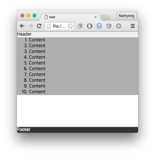
content의 height < browser의 height인 경우
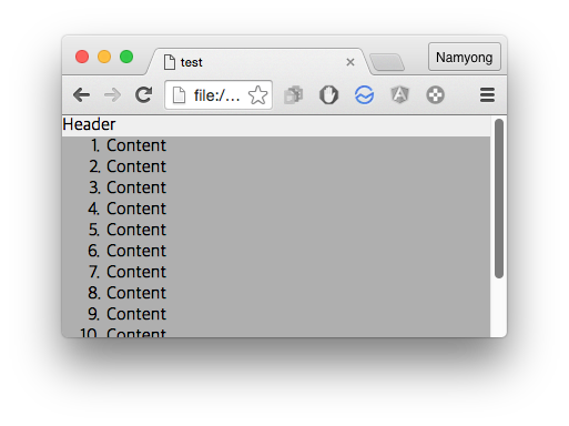
content의 height > browser의 height인 경우
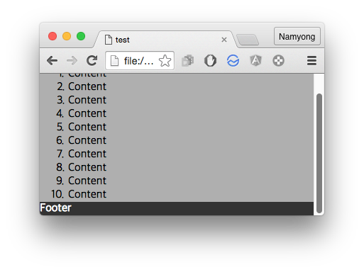
scroll을 내려보면 content 하단에 붙어있는 것을 확인할 수 있다.
원했던 구성이 깔끔하게 처리되었다.
(content의 height가 browser의 height보다 짧은 경우에는 하얀 여백이 보여지게 되는데 이부분은 div.wrap의 background-color를 주는 식으로 해결이 가능하다.)
이제 layout을 구성한 css를 확인해보면 다음과 같다.
* {
box-sizing: border-box;
-webkit-box-sizing: border-box;
-moz-box-sizing: border-box;
}
html {
height: 100%;
}
body {
margin: 0;
height: 100%;
}
.wrap {
min-height: 100%;
position: relative;
padding-bottom: 19px; /* footer height */
}
header {
background-color: #EFEFEF;
}
section {
background-color: #AFAFAF;
}
ol {
margin: 0;
}
footer {
position: absolute;
bottom: 0;
left: 0;
right: 0;
color: white;
background-color: #333333;
}
기본적인 개념은 다음과 같다.
- html, body의 height를 100%로 설정
- content의 height가 browser의 height보다 짧은 경우를 위해 div.wrap class에 min-height: 100% 설정
- footer는 position: absolute로 하여 bottom: 0에 고정
- footer를 content기준으로 위치를 잡기 위해 div.wrap class를 position: relative로 설정
- footer가 content(section)과 겹치지 않게 하기위해 div.wrap에 footer높이 만큼 padding-bottom을 지정
- padding-bottom에 지정한 값을 영역값으로 잡기 위해 box-sizing을 border-box로 지정
이 방법의 경우의 전제조건은 footer의 height값이 고정이어야 한다는 것인데 footer의 height값이 가변인 경우에는 좀 더 고민을 해봐야 할 것 같다.
추후 관련 issue가 발생되면 추가로 post할 예정이다.
CSS에서 속성값을 %와 px 연산이 필요한 경우 calc() 사용하기
가끔 element의 위치를 잡다보면 %로 잡은 후 몇 px만큼 조정하여 위치를 잡고 싶을때가 있다.
이럴때 javascript를 활용하여 element가 load된 후 element의 위치를 알아내 원하는 px만큼 조정하는 방법도 있지만
CSS를 활용하면 javascript없이 비교적 깔끔(?)하게 해결할 수 있다.
사용법은 다음과 같다.
calc(expression)
expression은 수치는 %, pt, px, em, rem 등의 단위를 사용하며 연산에는 사칙연산( + , – , * , / )을 사용할 수 있다.
이때 사칙연산시 0으로 나누게 되면 오류가 발생하니 주의가 필요하다.
또한 expression의 수치와 연산자는 반드시 공백문자(space)가 들어가야 한다.
사용예는 다음과 같다.
.someclass {
top: calc(100% – 10px);
}
calc는 browser 호환성 issue가 있으므로 MDN calc page를 참고한다.
대략적으로는 IE 9이상, FF 16이상, Safari 6/7이상, Chrome 19/26이상에서 지원한다.
CSS로 Vertical center 맞추기
CSS로 element를 vertical center를 맞추는 방법이다.
먼저 파란색 div 안에 초록색 div가 다음과 같이 있다고 가정한다.
[HTML]
<div class=”.container”>
<div class=”.vertical-center”><“div>
<“div>
[CSS]
.container {
width: 100px;
height: 300px;
background-color: blue;
}.vertical-center {
height: 100px;
background-color: green;
}
vertical center를 맞추는 방법의 핵심은 초록색 div를 상단으로 부터 50% 내린다음 (top : 50%)
element의 높이의 절반만큼 Y좌표를 transform 시키는 것이다.
이를 순차적으로 보면 다음과 같다.
[CSS]
.vertical-center {
…
position: relative;
top: 50%;
}
초록색 div의 top을 50%주게 되면 px값으로 계산하게 되면 실제로는 parent element인 파란색 div의 height인 300px의 절반인 150px이 된다.
vertical center를 맞추기위해서는 top이 100px이 되어야하는데
여기서 초록색 div 높이의 절반인 50px만큼 top을 올리게되면 원하는 값이 된다.
position: relative를 준 이유는 parent element를 기준으로 위치를 잡기 위해 사용되었다.
[CSS]
.vertical-center {
…
position: relative;
top: 50%;
transform: translateY(-50%);
-ms-transform: translateY(-50%);
-webkit-transform: translateY(-50%);
}
최종적으로 처리된 결과이다.
transform은 browser 호환성 issue가 있으므로 MDN transform page를 참고한다.
대략적으로는 IE 9이상, FF 16이상, Safari 3.1/9.0이상, Chrome 4.0/36.0이상에서 지원한다.
 nybounce